Action
Project Overview
The project:
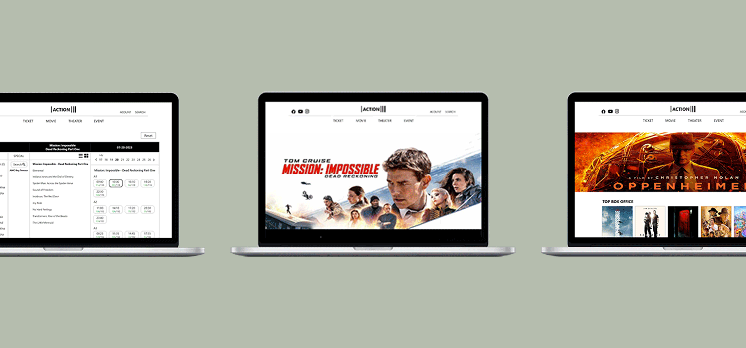
'Action’ is a website for movie ticket reservation. Action strives to offer easy, fast, and intuitive reservation process for users. The website targets anyone who can access to the internet, especially metropolitan and suburban areas.
Project duration:
June 2023 to July 2023
The problem:
People spend too much time in browsing movies and sometimes it’s hard to use for foreigners.
The goal:
Design a website that allows users to reserve tickets and document the movie history with their friends or family.
My role:
UX designer designing a website from concept to delivery
User research
Pain points
Time
People spend too much time on browsing movie and its information
Accessibility
Platforms for booking movie tickets are not equipped with assistive technologies
IA
Text-heavy in booking process and notice is difficult to read and understand
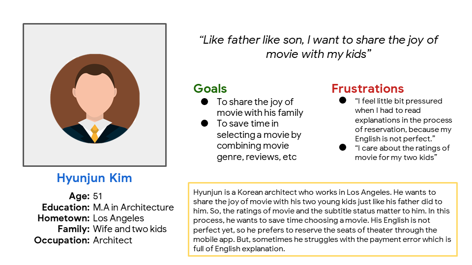
Persona
Sitemap
The main elements of website are movie, theater, and booking that are essential for main flow. Also, I added the event, my page, and log-in page. Through this, I prioritized a quick and easy process of reservation to help users save time.
Digital wireframes
The reservation step indicator helps user to follow the process.
User can check the timetable and the number of seats left.
Digital wireframes screen size variation
This is a home screen for the iPhone (12, 13, 14) version as a responsive website.
Low-fidelity prototype
Using the completed set of digital wireframes, I created a low-fidelity prototype. The primary user flow I connected was choosing and booking a movie ticket, so the prototype could be used in a usability study.
Usability study: findings
Users are not used to English sometimes
Some pages are too much divided unnecessarily
Reservation steps could be changed whenever users want
Mockups
In the early design of the movie page, 5 representative coming soon films were located side by side, but after usability study, the films were provided in chronological order. This makes it easier for customers to grasp at a glance and adds a function that can be saved using bookmarks.
The usability study showed the need of revision in event page. So, I integrated all the event section and make the thumbnails bigger than before.
Mockups - original screen size (web 1920)
Mockups - screen size variations (mobile website)

High-fidelity prototype
The final high-fidelity prototype presented sophisticated user flow for reserving movie tickets. It also met browsing, sharing, reserving movie all at once for people including foreigners.
Accessibility considerations
Used icons to help make navigation easier
Used images and numbers to help all users better understand the designs
Used simple and satisfied contrast of color for distinct usability
Takeaways
Impact:
The website makes users feel like Action is a total website for movie reservation that met the users’ needs.
One quote from peer feedback:
“This website is unique in terms of the booking process because I can grasp everything in one page. I think it’s easy to use for everyone.”
What I learned:
This Action website design tried to share the concepts of the Action app, which was my first UX design project. By doing so, I could learn the importance of the responsive design and the difference between Figma and Adobe XD.


