edyou
The project:
'edyou’ is a service to help people without income get access to quality education. Edyou targets anyone who can access to the internet, especially English users.
The problem:
People spend too much time in searching free but quality education. Also, the users’ need of subjects and levels they wanted is different.
The goal:
Design a service that allows users to find and register courses they want easily.
My role:
UX designer designing a website from concept to delivery
Responsibilities:
Conducting interviews, paper and digital wireframing, low and high-fidelity prototyping, conducting usability studies, accounting for accessibility, and iterating on designs.
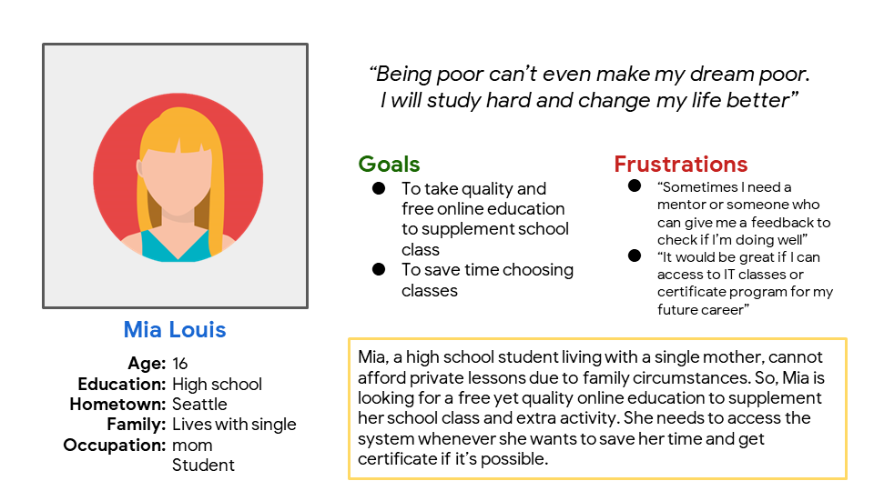
Persona
Problem statement:
Mia Louis is a high school student who needs systematic curriculum and mentor’s advice because her family can’t afford expensive private lessons.
Problem statement:
Jason Martin is a journalist who is about to move to Korea for his work who needs proven and free courses because he has to save money.
User journey map
Competitive audit
Compared and analyzed 4 sites -TED, Coursera, KHN Academy, and EBS- that provide online education services.
Digital wireframes
The mobile app is designed for iPhone 14 Plus, 13 Pro Max, 12 Pro Max. The home page focuses the basic role of the edyou that is easy to browse the courses.
Important notice or event will be located
Users can easily see the best courses in each subjects.
Low-fidelity prototype
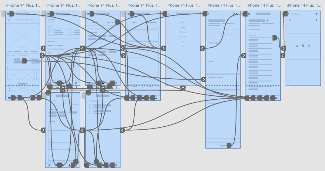
I created a low-fidelity prototype based on the completed set of digital wireframes. The primary user flow I connected was searching and registering the course.
Usability study: findings
Some pages are divided with too many rectangles
Mentor system need to be more highlighted and accessible.
Course information page is quite long
Mockups
On the initial home screen, the type of course could be checked through horizontal scrolling, but later, it was improved in the form of cards being passed one by one through clicking the arrow. This new version needed different interaction in subject selection. Also, the images of teachers were toned down to blend in with surroundings.
Among the group talk configurations, the mentor talk was separated after the feedback. By doing so, users could easily access and communicate with their mentors.

High-fidelity prototype
The final high-fidelity prototype presented sophisticated user flow for taking courses. It also met connecting people and searching suitable courses all at once for free.
Accessibility considerations
Used world-renowned default icons for easy navigation
Used basic English words for foreigners
Used simple and satisfied contrast of color for distinct usability
Sitemap for responsive design
The main elements of website are course, teacher, and search that are essential for main flow. Also, I added the notice, my page, and log-in page. Through this, I prioritized a quick and easy process of finding and taking courses to help users save time.
Responsive designs
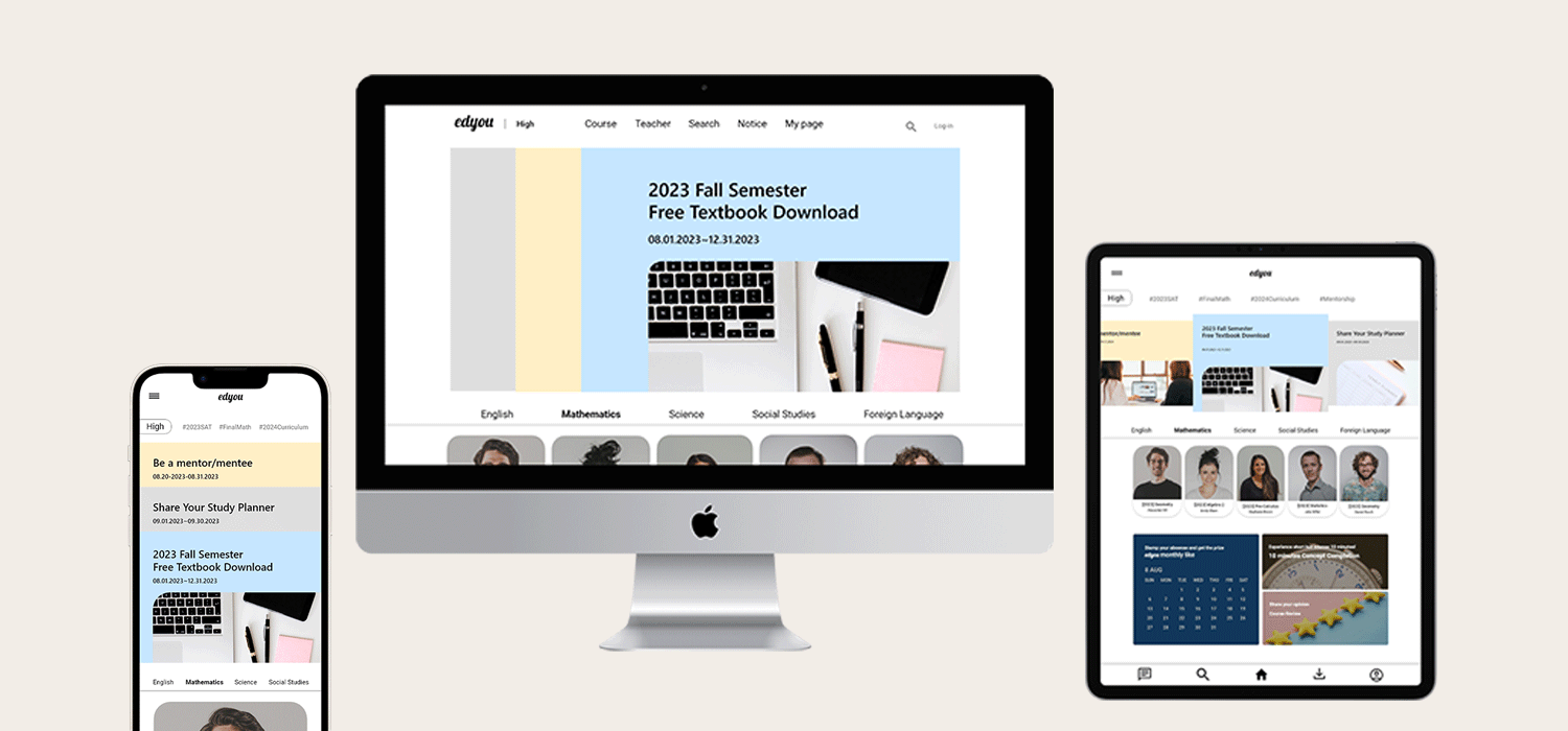
The design for screen size variation included mobile, tablet and desktop. I optimized the design to fit specific user need of each device and screen size.
Tablet (iPad Pro 12.9”)
Mobile website (iPhone 428 x 926)
Desktop web 1920
Takeaways
Impact:
The app and website of edyou make users feel this is a platform for easy learning and networking.
One quote from peer feedback:
”I can see edyou aims to provide quality education with intuitive navigation. I liked the part of being connected with others by chatting function.”
What I learned:
The ‘edyou’ is a compound word of ‘education’ and ‘you’ meaning education for you. Like the title, I also tried to design thinking users front and centered. I still have so much to learn, but I could realize and feel the joy and role of UX design.
Next steps
Add more pages that are missing and finish the link of full interaction in prototype
Design lifelong education service for adults based on the high school version of edyou
Conduct another round of usability studies to validate whether the pain points user experienced have been effectively addressed


